'Out of Darkness Cometh Light: The story of Wolves' home kit' by club historian, Pete Crump
The famous gold and black is now iconic across the footballing world, and we mark the start of our 150th campaign by looking at how our strip has developed during the past 150 years.
This is part 4 of the series on Wolves’ home kit history. To read part 1, focusing on how the club’s home kit changed between 1877 and 1930, please click here, for part 2, reflecting on the 1930s to 1960s, click here, and for part 3, which covers the 1970s and the first seven years of the 1980s, click here.
Scoreline/Manders and the Goodyear era
In 1988, a new shirt made by Scoreline – who were based in West Brom, next door to the Baggies on the Brummie Road – was launched. The iconic Manders sponsor was a perfect sponsor for Wolves with the historical importance of the family to the town/city.
This would remain until 1990 and is another classic. The only slight difference in the two is the Scoreline logo moving from the arm to front of the shirt in 1989.
The big change in 1990 would see long-serving sponsor Goodyear appear. The initial Goodyear shirts were also produced by Scoreline, but this shirt is now rare. In the very early programmes from that season there were issues with supply as, sadly, Scoreline were struggling. A new kit manufacturer was sourced, which was Bukta, and they would appear on the Wolves shirt for the first time on Saturday 10th November 1990.
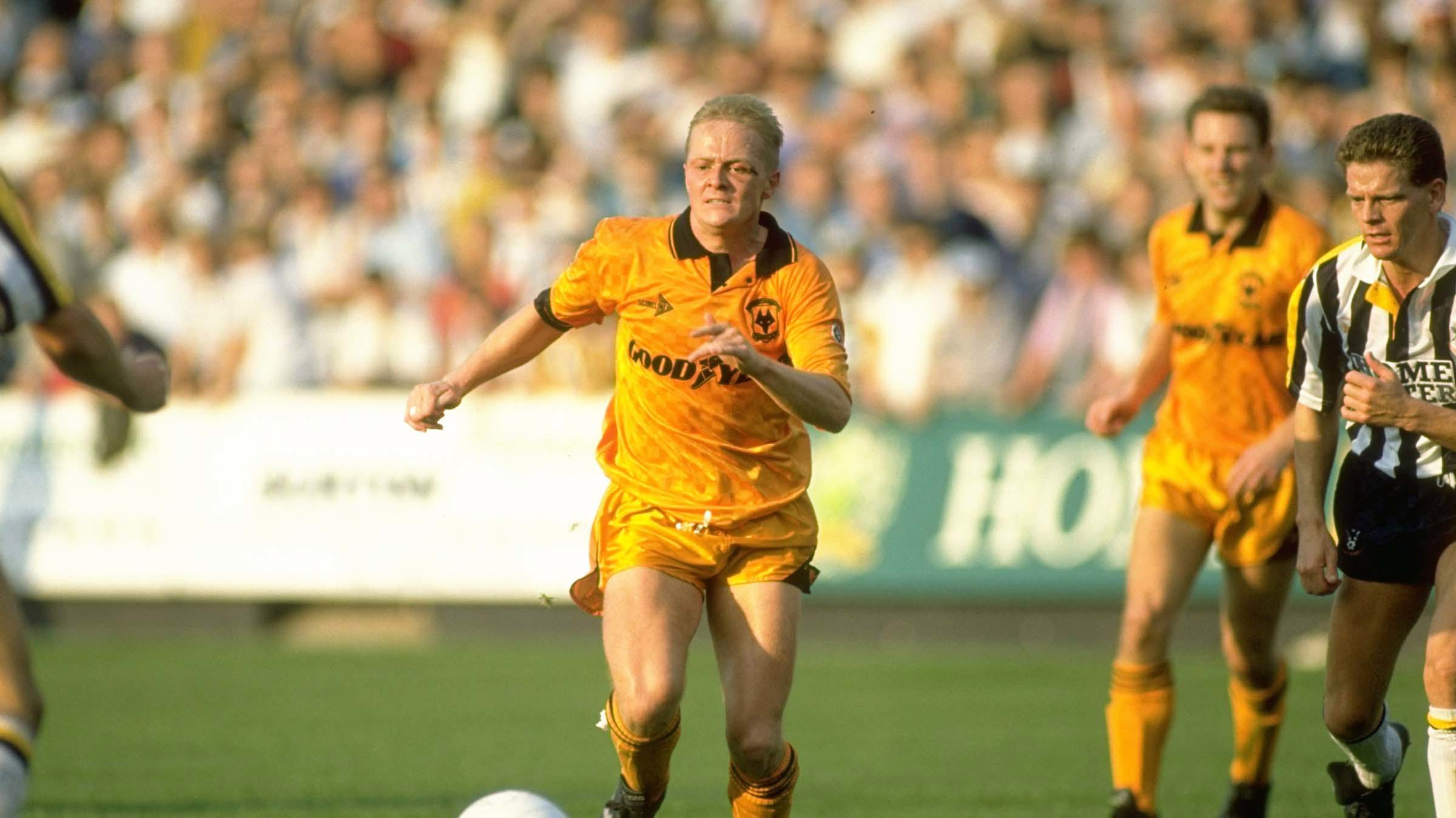
From what we know, Bukta became the first company to manufacture the Wolves shirt in two different eras, while Puma has also done this since. The Scoreline and Bukta shirts look the same from a distance but is the background template that is different.
After Bukta we then see the infamous ‘tyre track’ design in 1992/93. This shirt – which was an in-house design and production too – was controversial and it enraged some supporters at the time, however, it is now a very popular retro shirt and if you look around at a Wolves match this season, you will see someone wearing it.
Out of Darkness Cometh Light… Again
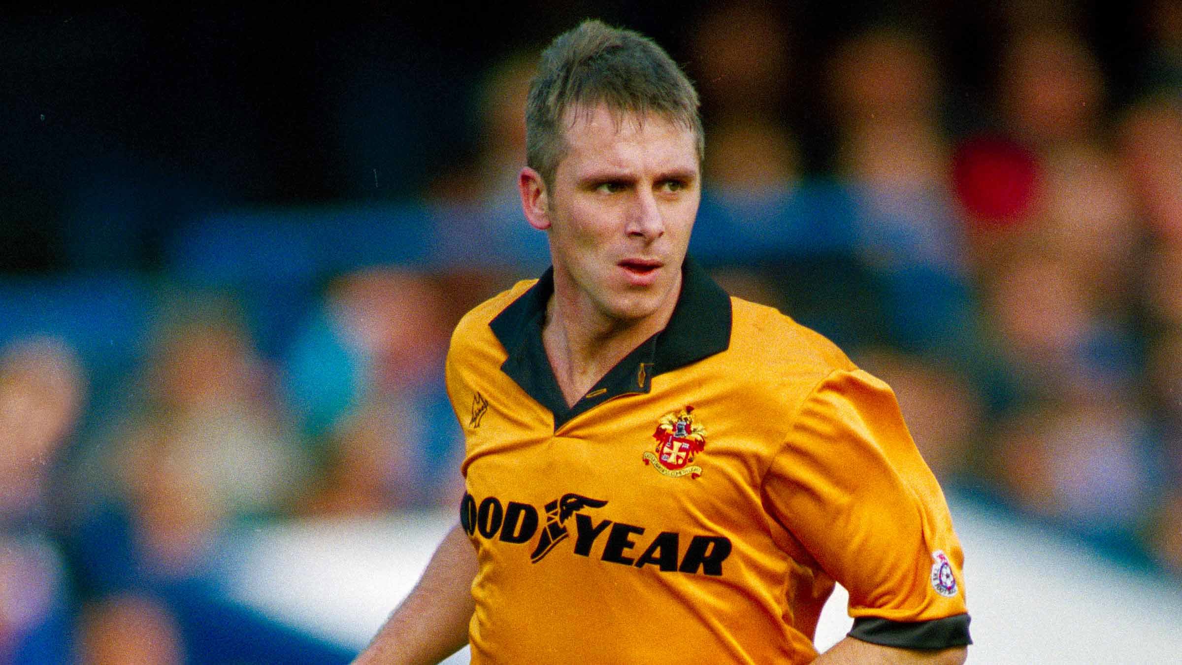
In 1993, it was a return to a more traditional style of Wolves shirt, with the town coat of arms returning. From 1993 to 1996, all Wolves shirts donned the coat of arms and were all traditional designs, although the 1995/96 shirt had a slightly different template. Again, these were iconic shirts but very traditional, and the polar opposite to its predecessor. During this era, we also saw American company Nutmeg produce kits, but it was then Puma’s turn from 1996 to 2000.
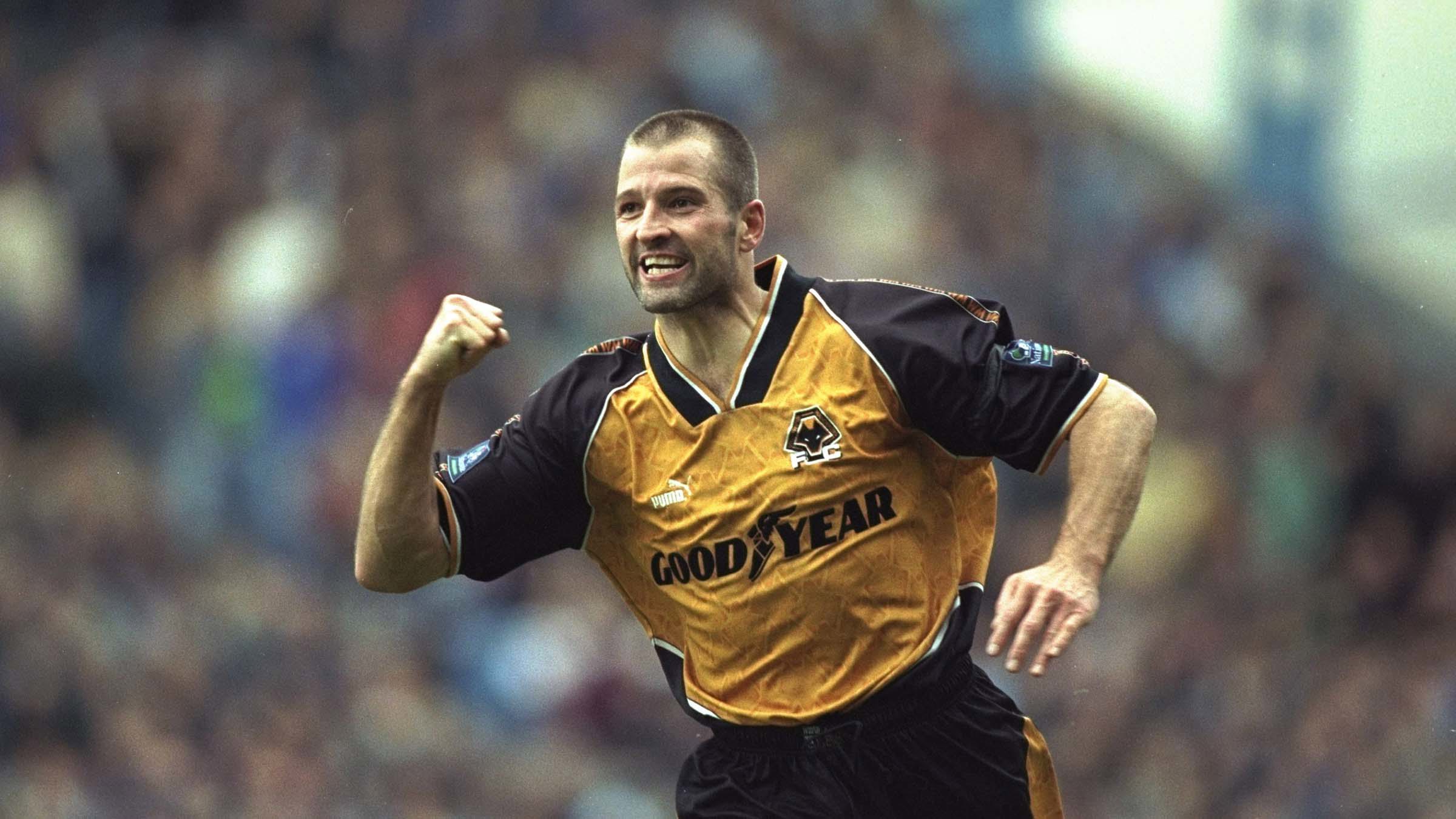
The now-famous wolf head shirts debuted in 1996 and remained until 1998, and like the ‘tyre track’ shirts, they were controversial and fair to say they are Marmite, because supporters either love them or the complete opposite.
The wolf head shirt also saw the return of hooped socks for the first time since 1986, and, for me, this was the first time I saw Wolves in hooped socks. The last time we wore them I was only eight months old.
To many of the players, the shirt was not the best to wear and could be uncomfortable and I have to be honest, they weren’t very comfortable for me as a kid to wear either, although I proudly wore them playing football with my friends at various iconic footballing venues in Wolverhampton, such as Bee Lane (Fordhouses) and Northwood Park and Top Field in Bushbury.
A more traditional and popular design would appear from 1998 to 2000 also made by Puma. This was very smart and slick and way more traditional than its predecessor, and is another which is still popular now with fans today.
Old Gold returns briefly before Admiral take over
In 2000, there would be a change to the gold. The shade of gold on the Wolves shirt had been reasonably consistent since around 1960, but from 2000 to 2002 the shirt returned to the shade of gold worn from 1931 to 1954.
Old Gold was back on the in-house design, although this has been termed by some supporters over the years as the ‘Dirty Orange’. This was also the final Goodyear shirt and brought to an end to that famous and long partnership.
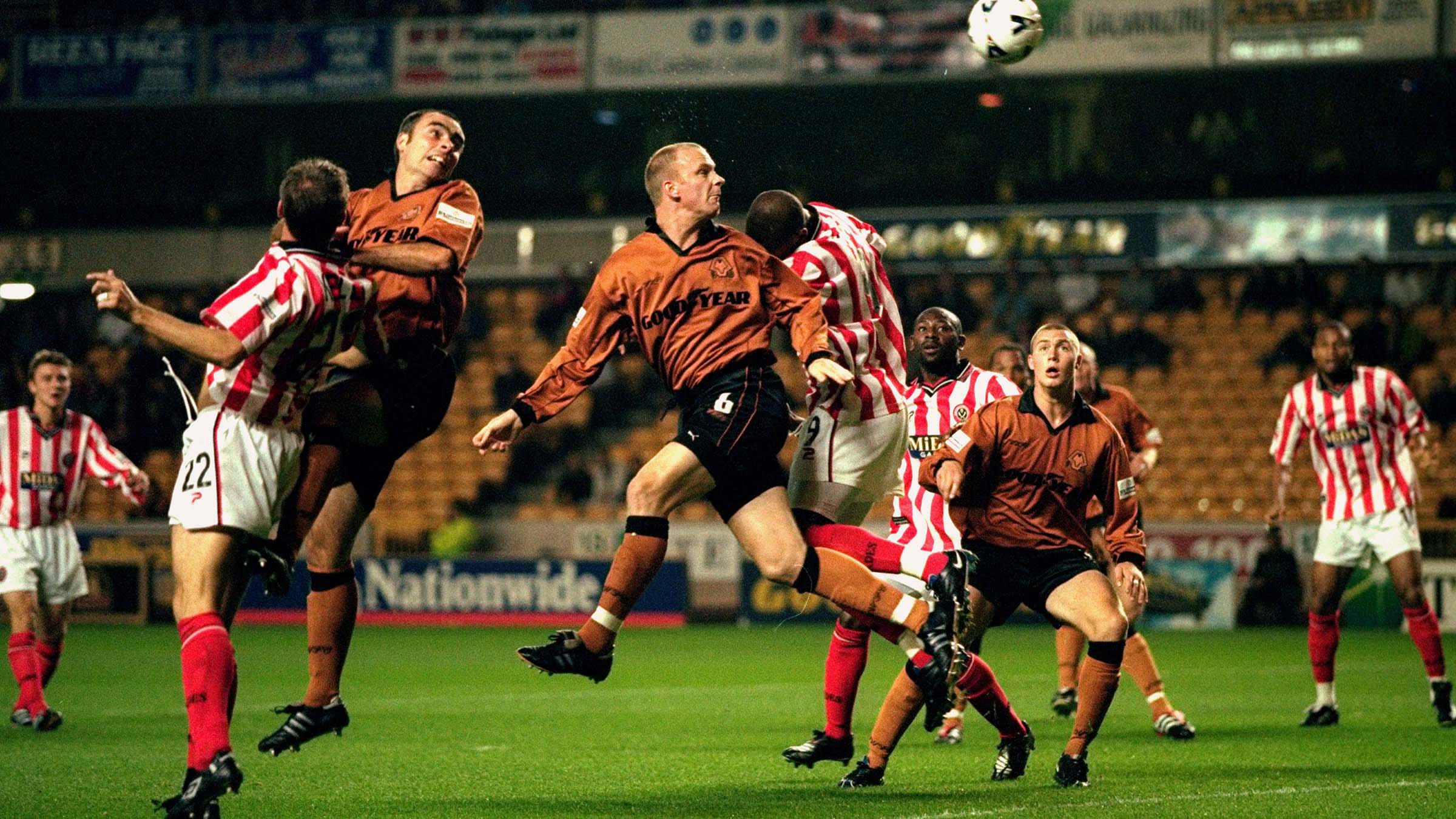
I found it sad to see Goodyear go as my childhood was the 1990s, so every Wolves shirt released I knew it would have Goodyear on the front. It was also special for many with how many people worked or had worked for them in the city over the years. In my area, Fordhouses, everyone had a family member or knew someone that worked for them.
In 2002, Admiral made the Wolves shirt for the first time. They are the company responsible for this article in many ways as they made the famous ‘Doritos’ Wolves shirt worn at the play-off final.
The shirt also saw a change to the socks as we made a return to black socks for the first time since 1935. The black socks continued for the first part of the Le Coq Sportif deal from 2004 to 2008, although there was a return to gold socks as Wolves won the Championship in 2008/09. During this era of black socks, there were gold socks available as an alternative away from home and pictures will show us wearing these from time to time.
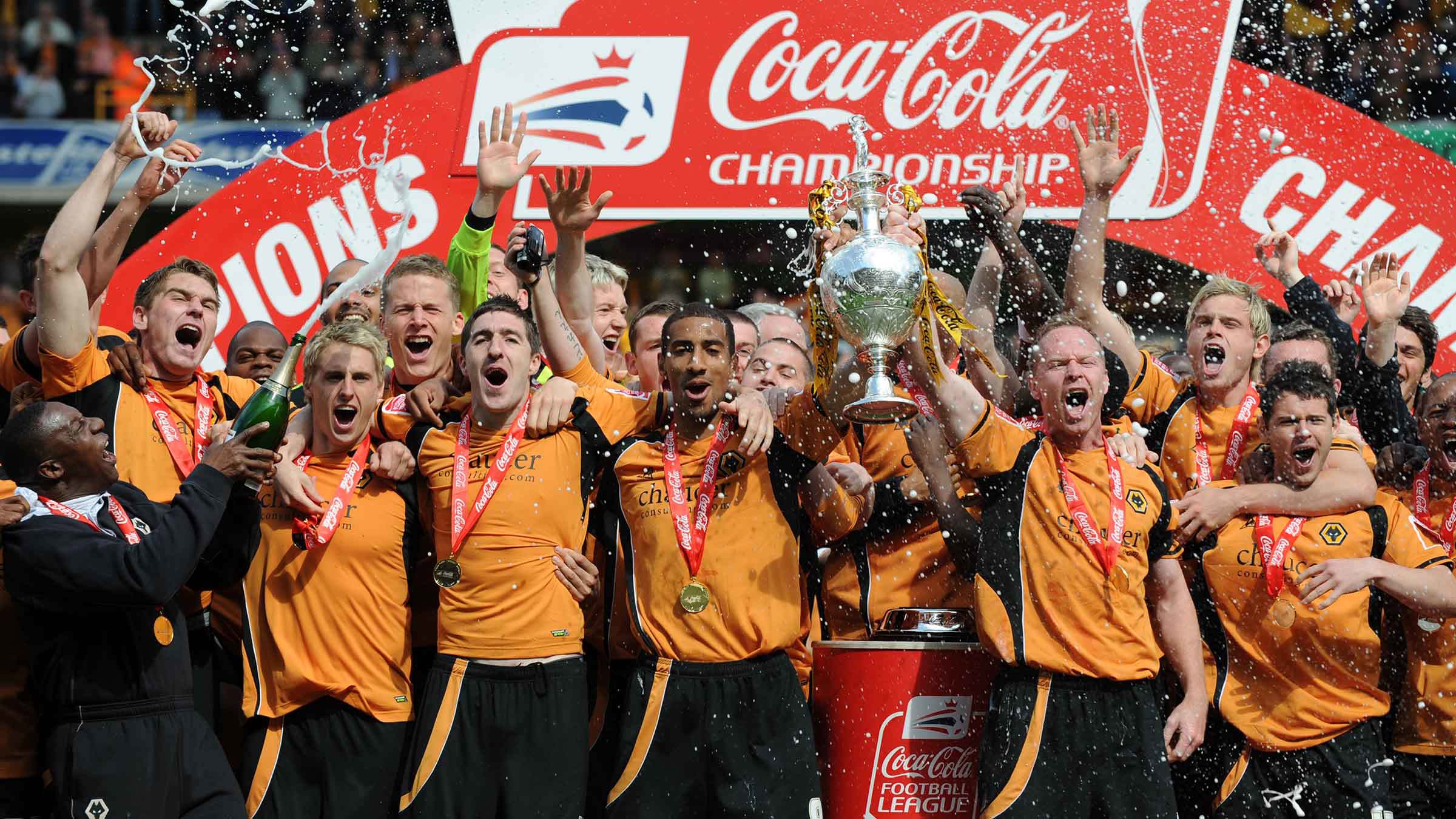
From 2010 to 2018, the Wolves shirt was made by Burda and Puma. All the shirts were plain and in the main traditional designs in ‘orangey gold’, however, the tone of the final Burda shirt in 2012/13 shirt was rather bright. We did see black arms in 2014/15 and a return to pin stripes for the first time since 1986 in 2016/17.
Merry marigold is back
In 2018/19, we saw a huge change in the colour of the shirt. The first shirt under the Adidas deal was a ‘yellowy gold’. Despite the change, this shirt was a very good seller, with the style very plain and striking.
It was, however, a return to Phil Morgan’s ‘merry marigold’. This is quite similar to the 1956 to 1960 home top in shade, with the exception of the 2019/20 season which saw a return to the more orangey-gold and black socks again. The shirt has been a yellowy gold since, although we did see another return to black arms in 2020/21 for the first time since 2014/15.
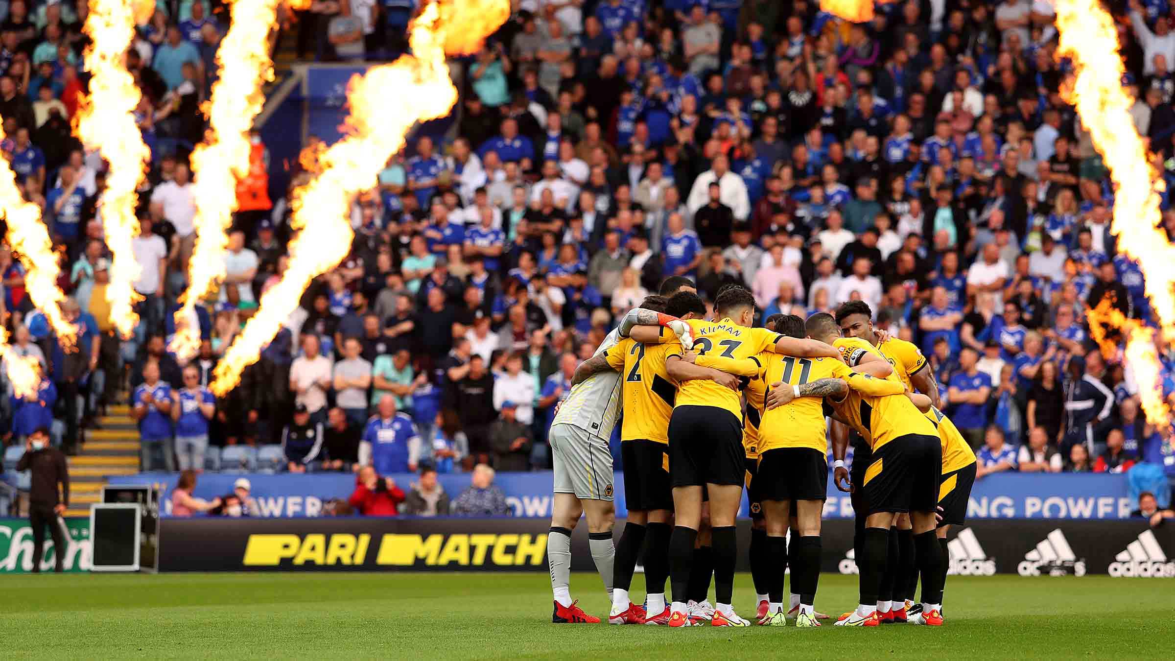
During the first year of the Castore era in 2021/22, there was a slight issue with the new gold socks, which saw Wolves start the season with black socks at Leicester. However, gold was back for the first home game against Spurs the week later.
With SUDU taking over in 2024/25, we did see the return of a central badge for the first time since 1979. Last season’s top was also influenced by and incorporated the Molineux Pleasure Gardens, with SUDU’s first two efforts being modern takes on 1970s shirts.
But this season, we are back in the so-called ‘orangey gold’ by popular demand. This shirt also takes us back to the 1960 FA Cup final, with a nod to 1921 and 1939 too, as well as making us think of 1993 to 1996. The keeper top is also a rather traditional number too.
In a survey carried out on the Wolves App in March/April 2025, a total of 8,806 supporters responded with 4,118 (47%) voting for orangey gold, 3,521 (40%) voting for old gold and 1,167 (13%) voting for yellowy gold. We will always have Wolves supporters who favour one shade over the other, however, we hope this is in the main is well received.
This, combined with the city coat of arms, makes the new shirt a fantastic addition to our kit collection, and has also brought up a lot in the fan discussion and feedback.
Final thoughts
It was very hard to keep the new shirt under wraps after being in the making for more than two years. SUDU and Levy Merchandising have visited the museum on several occasions now and they take our history very seriously. We also held the supporter meeting too and, following that, we had the vote on the app for the shades of gold. I was fortunate to see this shirt many months before its release, so I was very excited for everyone else to get a look at it.
I genuinely feel it is one of the best shirts released in my lifetime. I love the Wolves badge, but it is lovely to see the return of the coat of arms. This is first time it has been on the Wolves shirt since we gained our city status in 2000, and because the football club is an integral part of the city, to be donning the city’s badge in our 150th year is very special.
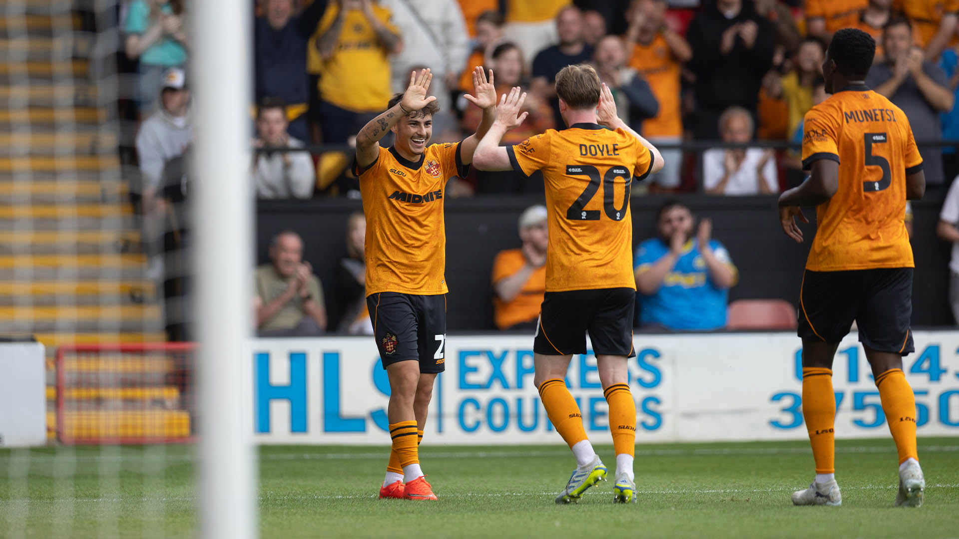
The city coat of arms is also displayed how it was in the 1960 FA Cup final with ‘Wolverhampton Wanderers’ instead of the city motto. I like both, but this is a modern twist on that 1960 shirt. The first person I thought of when I saw the shirt was Bill Slater iconically lifting that FA Cup in 1960, so to evoke that image in my mind can only be a good thing.
To everyone at SUDU/Levy Merchandising I have to say well done. To all the supporters, brace yourself for the away and third shirts coming out very soon. I genuinely think you are going to really like them.
We hope you have enjoyed this journey through our home strip. We will look at the away shirts, our badge, the history of Molineux and many more subjects this year.
This is our big birthday after all.
Out of Darkness Cometh Light.
Wolves historian Pete Crump’s weekly articles reflecting on a range of topics from the club’s proud past will be available throughout the 150th anniversary season on wolves.co.uk.


