'Out of Darkness Cometh Light: The story of Wolves' home kit' by club historian, Pete Crump
The famous gold and black is now iconic across the footballing world, and we mark the start of our 150th campaign by looking at how our strip has developed during the past 150 years.
This is part 2 of the series on Wolves’ home kit history. To read part 1, focusing on how the club’s home kit changed between 1877 and 1930, please click here.
The old gold and black army
In 1931, a new darker shade appears, and this would last until 1954. This shade of gold is what many Wolves supporters regard as the so-called ‘Old Gold’.
From 1931 to 1935 the socks are black, but from 1935, however, they change to the famous hooped socks. Gold and black hooped socks would be a constant for Wolves from 1935 to 1962.
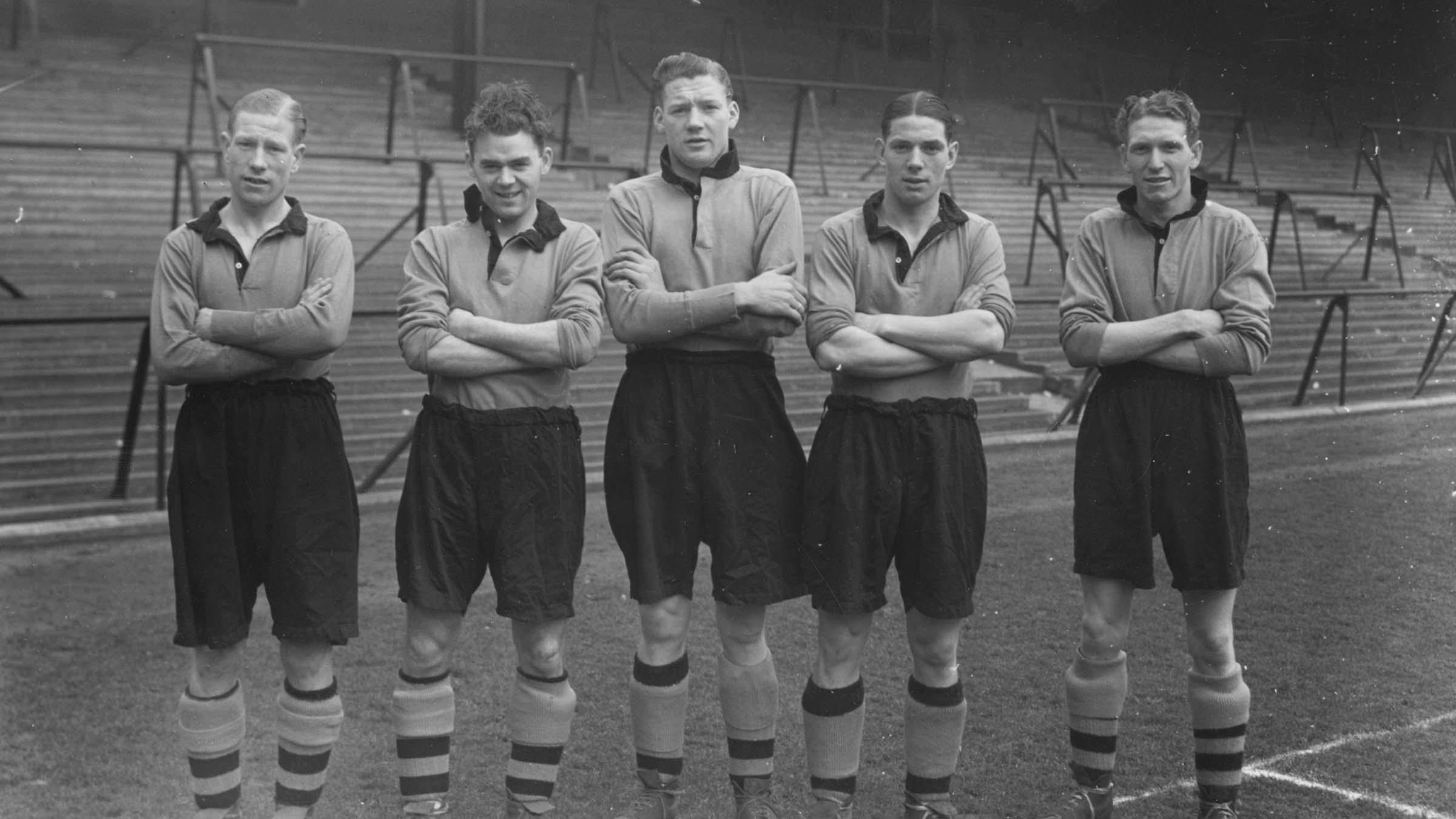
During this era, the town coat of arms appears again in the FA Cup Final of 1939, and it also appears on the Wolves shirt in the 1947/48 season. We believe it appeared on the shirt that season due to Wolverhampton celebrating 100 years since it had become a municipal borough. This was, however, the first season that the Wolves shirt had a badge on during league games.
From 1951, we also saw intermittently the famous Rayon silk shirts. The rayon silk shirt is made of artificial silk and was designed to reflect the floodlights. It was worn in the second half of three league games against Charlton Athletic, Middlesbrough and Manchester City – all at Molineux – in November/December 1951.
It was also worn by youth player Brian Punter in a youth game at Dudley’s Revo Electric game near Tividale, but most famously, they were worn in some of the floodlight friendlies of this era.
This shirt is so strange, and to the naked eye can appear as salmon pink, but the colour changes under artificial light. But this shirt could be described as the shirt that helped us transition from ‘Old Gold’ to a lighter shade of gold. One of the reasons for this was the old and darker gold not showing up great under the floodlights.
The new shirt colour is discussed in the opening home programme of the 1954/55 season…
“We have chosen this unique occasion, appropriately, we think to present our new team in a new a brighter strip. The old gold and black colour scheme, which has become so famous in British Football, has been retained but we think the new colour will be not only more acceptable but easier to follow on those duller winter days”
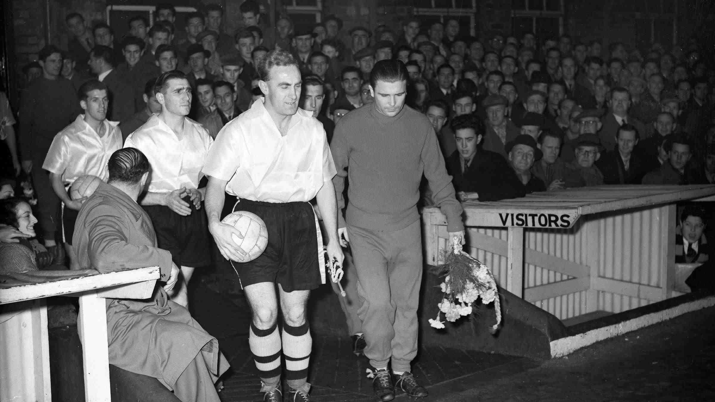
My fellow Hall of Fame Committee member, friend and hugely respected writer on Wolves, Steve Gordos, is very passionate on the old gold subject and has rightly pointed out we haven’t worn it since 1954, apart from two seasons at the start of this century. His research also states that Phil Morgan, in his Express and Star report of the opening game of 1954/55 versus Shefield Wednesday, described Wolves in “their merry marigold shirts”. Morgan was also a commentator.
By 1956, the Wolves shirts – like many shirts of that era – started to look more like the kind of football shirts we recognise today, as they moved away from looking like a rugby top.
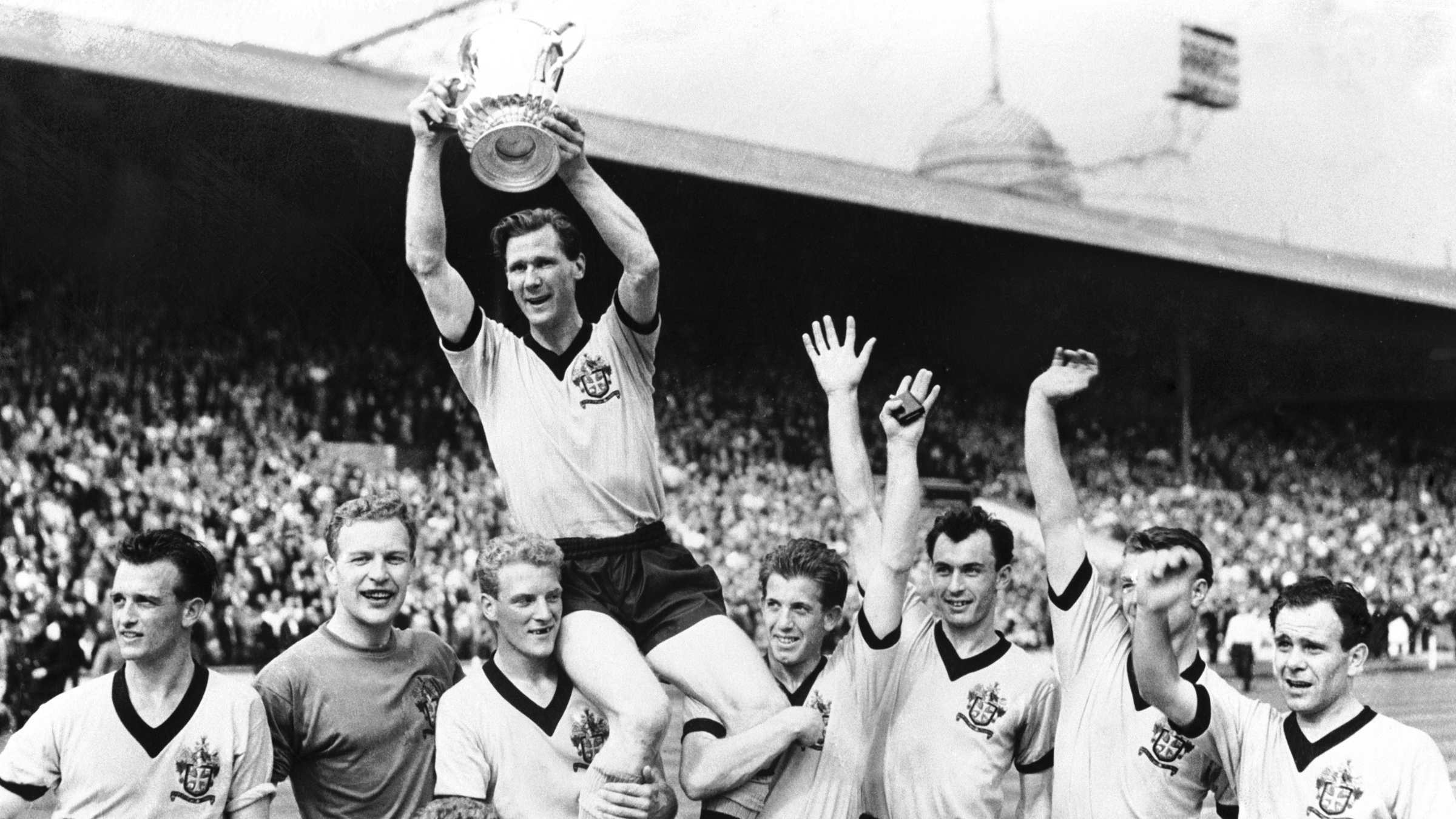
The shade of gold from 1956 to 1960 is also more similar to the shade of gold we have worn in recent years – the unofficially termed ‘yellowy gold’, or as Phil Morgan stated, “merry marigold”. But during the 1960s, the shirt becomes more ‘orangey gold’. The 1960 FA Cup final shirt, which again dons the town coat of arms, is more of an orangey shade than the 1956 to 1960 version.
This final also shows Wolves wearing the coat of arms and winning, unlike 1921 and 1939, while no badge appeared at all on the old gold shirt of the FA Cup Final in 1949.
There was a slight difference to the city coat of arms in 1960 to that of before. It doesn’t have the motto ‘Out of Darkness Cometh Light’ in the banner, instead it says Wolverhampton Wanderers. Judging by the results in the previous cup finals, does having the club’s name in the banner a little luckier? Who knows!
By 1962, the round necked collar style appears. We also get the first appearance since 1930 of full gold socks. We would not see hooped socks again until 1983. The 1960s Wolves shirt, although plain in design, were still striking.
Then in February 1965, there was a big change that wasn’t unanimously popular at the time. My dad, who is now 81, still gets annoyed with this change to this day, but only in an amusing way.
All Gold
In February 1965, Wolves played Aston Villa at home in an FA Cup fifth round replay. It saw the appearance of the ‘THAT ALL GOLD STRIP’, as was termed by the Express & Star at the time.
The day before the game, then-manager Andy Beattie had produced one of the pairs of new bright gold shorts and asked the players if they would like to wear them. The reason, we believe, was that it allowed the players to see each other more clearly in duller conditions and under the lights. It wasn’t known at the time of the Express & Star article if this was going to be a permanent fixture.
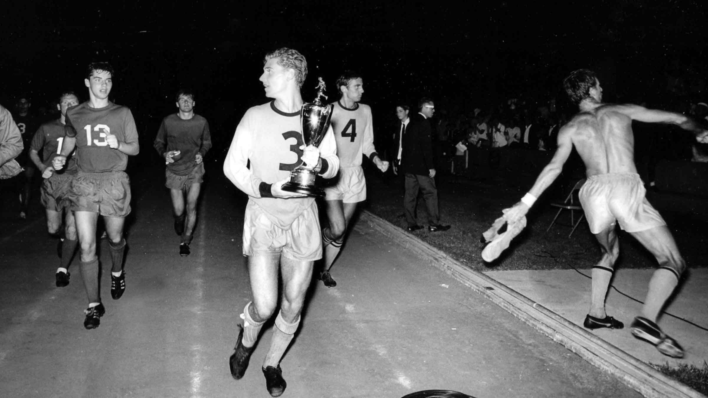
The gold shorts remained and Wolves wore all gold for the remainder of the 1964/65 campaign. They also wore them for the 1965/66, 1966/67, 1967/68 and 1968/69 seasons, while they were also worn by LA Wolves, in a strip that you may remember had the players’ numbers on the front.
I think my dad thought it was just a small fad. He was annoyed when the team ran out at Coventry City on the opening day of the 1965/66 season and he realised they were here to stay for a while.
However, it must be pointed out that Liverpool had also changed to all red in December 1964, and this has lasted the test of time. Prior to that, Liverpool wore white shorts. Around the time, it appears a fashionable thing, and maybe TV was also a bearing, as Match of the Day began in August 1964 and The Big Match also followed in August 1968. Football was gradually being televised a bit more, but most people at this time still had black and white TVs.
In 1969/70 we saw the return of the black shorts. This is also detailed in the matchday programmes, and it states how supporters had been writing in and that the change was popular. I don’t think my dad did send in a letter, despite his complaints at the time. Wolves also wore black shorts on the tour of USA in 1969 as Kansas City Spurs. Also, the first colour TV broadcast occurred in November 1969, and by the early 1970s, more and more people had colour TVs.
Iconic shirts of the 1970s
Into the 1970s we see a consistent orangey gold throughout, but with many different variations of collar and style too. More technology appears with aertex designs and we also see three different badges, which we will look at in more detail later in this special anniversary season of articles.
The 1970s Wolves shirts are iconic, whether they are donning the W with the single Wolf or the three leaping Wolfs. To this day, we see many supporters, both young and old, who love these shirts, and rightly so, as they are fantastic.
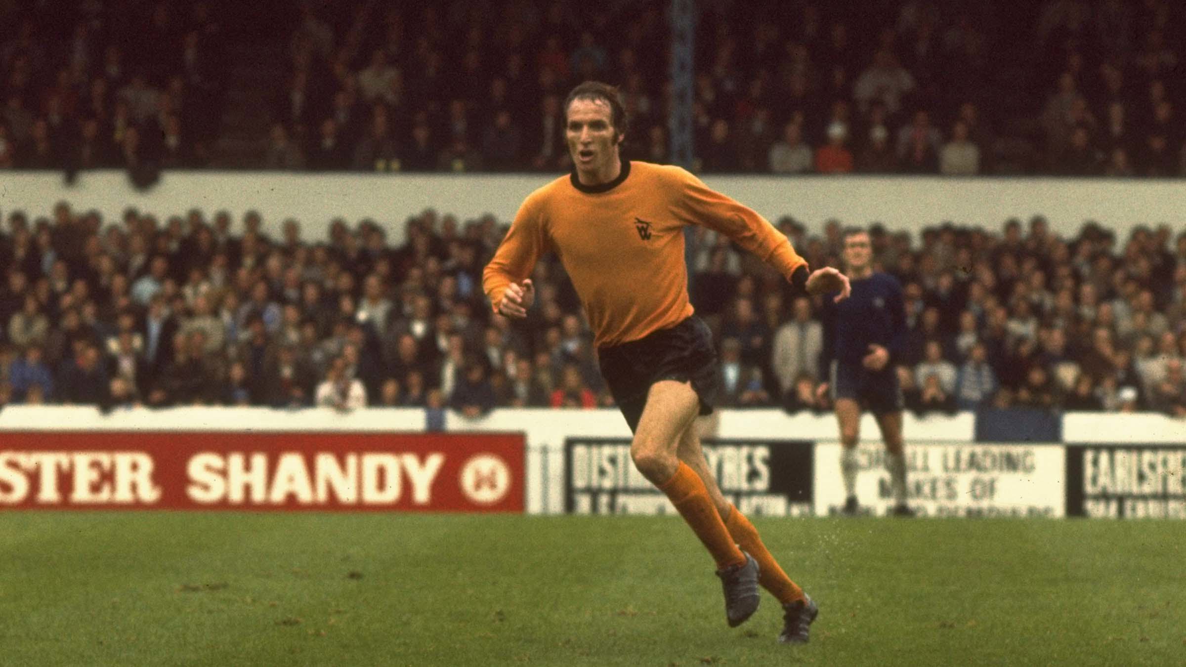
Many people you see wearing these shirts are too young to remember them at the time, however, this shows how popular they are. I am one of those people. I love the long sleeved early 1970s shirt a lot, however, any of the shirts from the 1970s home or away I would wear with pride.
In 1970 we saw Wolves have their first ever club badge, the second one followed in 1974 famously at the League Cup final. The two badges would last just over nine years combined – not even a decade – but look at how they are still loved to this day.
The shirts of the 1970s are simple, plain, striking and iconic. They were made by our then-long-term partner Umbro and were also slowly becoming more commercial assets with Umbro being clearly displayed either down the sleeves or on the breast as the decade moves on.
We’ll look more into the 1970s era, and future generations of the Wolves home kit, over the next two weeks.
Wolves historian Pete Crump’s weekly articles reflecting on a range of topics from the club’s proud past will be available throughout the 150th anniversary season on wolves.co.uk.


